The first major project that I took on at FREAC was to look at how we could make maps that communicated multiple types of data. For this, we eventually discovered Bivariate maps and went about looking at the different ways color and data classifications can create dynamic maps that can really tell a story. This project post will go through the progression of our research and investigation into the subject and the thought process behind the choices that we made to set up our go-to color model for creating bivariate maps.
Introduction
One of the earliest examples of bivariate mapping methods that we looked at was by the talented Joshua Stevens. He had publish an article that acted as a guide to get a basic group of colors that worked well for bivariate mapping. When myself and the rest of the team looked at the map, we thought it was a great presentation of how you can easily visualizion two data sets, but it still did not make it seamless for the reader to understand the data at a quick glance. How does this one shade of purple differ from this other one and what does it mean for each of the variables? We still felt there was too much time dedicated to finding a place of interest and then consulting the legend to see what it means. Though the bivariate legend that Steven's had crafted was better than the simple overprinted method that existed from the Census day's, there was still room to make those colors even more meaningful and discernable.
Enter the usual process of scouring JSTOR and looking for all the research articles on the topic of Bivariate Mapping. Eventually our team discovered our savior. A statistician named Bruce Trumbo. In 1986 he published an article in a statistically focuesed journal around bivariate mapping that would form the basis of our narritive of bivariate mapping and how we will continue to approach it.
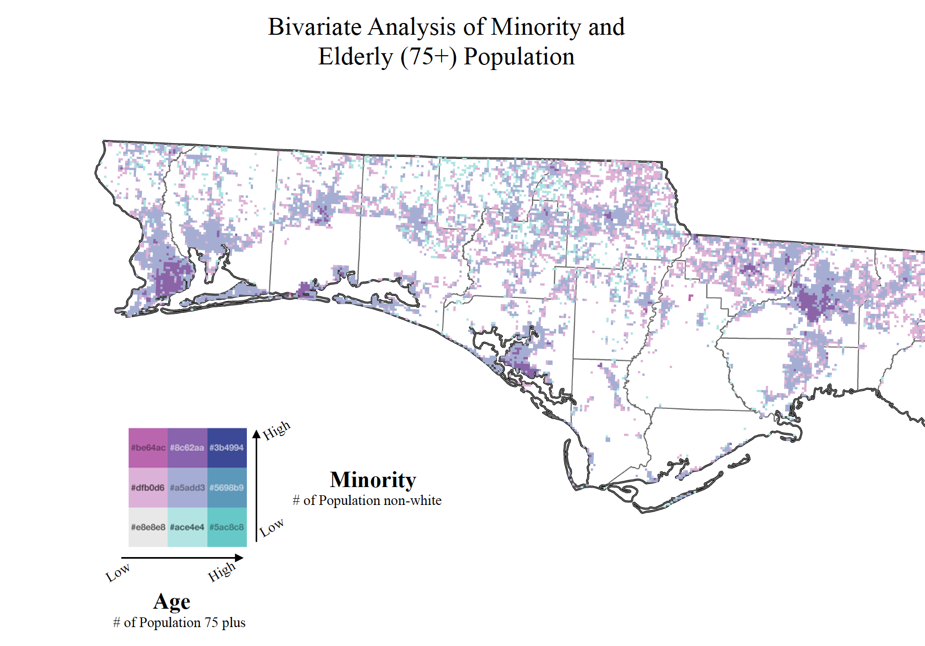
This is our first attempt at using Joshua Steven's color model on a bivariate map of the panhandle of Florida.
As we begin to tear apart this new discover, the Trumbo paper, we are really intrigued with his argument and thought process of going about choosing colors. This very statistical approach made for some rather dry reading and as a cartographer, the lack of any maps was just forcing us to try out his methods. The many color models and graphics that he includes are a great introduction to the theory behind why his colors show promise. In order to understand them more, I took to learning all I could about color theory and color models. Specifically focused on the Ostwalt Color model, I begin to understand what all the number values in the paper meant. The struggle really began when I started to take his simple color descriptions of "vivid red" and "deep leafgreen" into hex codes and RBG values ready for ArcMap. Luckily I was able to find some examples of the Ostwalt color model online and then color pick a set of colors that align with Trumbo's written descriptions.
To make a long story short, we were able to build out 3 different color models to use for most of our bivariate mapping needs. With a focus on the story and using your data as a way to influence your color decisions, this model provides highly readible and logical color choices. Trumbo breaks his analyses into three basic subsets called "Corners, Range, and Diagonal". These serve different types of distributions that your data might split into and is a great way to think about what you want the map to communicate. Every map that is meade is meant to tell a story and if one establishes their colors in the beginning than less questions will be raised by the reader and the data that is supposed to be highlight can be shared.
With this inherent bias that is put into the map, we had to ensure that the reader wasn't simply tricked or assumed to be less intelligent. We wanted to present the data upfront in a way that communicates how the colors are used even more. This sprung our exploration into Bivariate Statistical Legends.
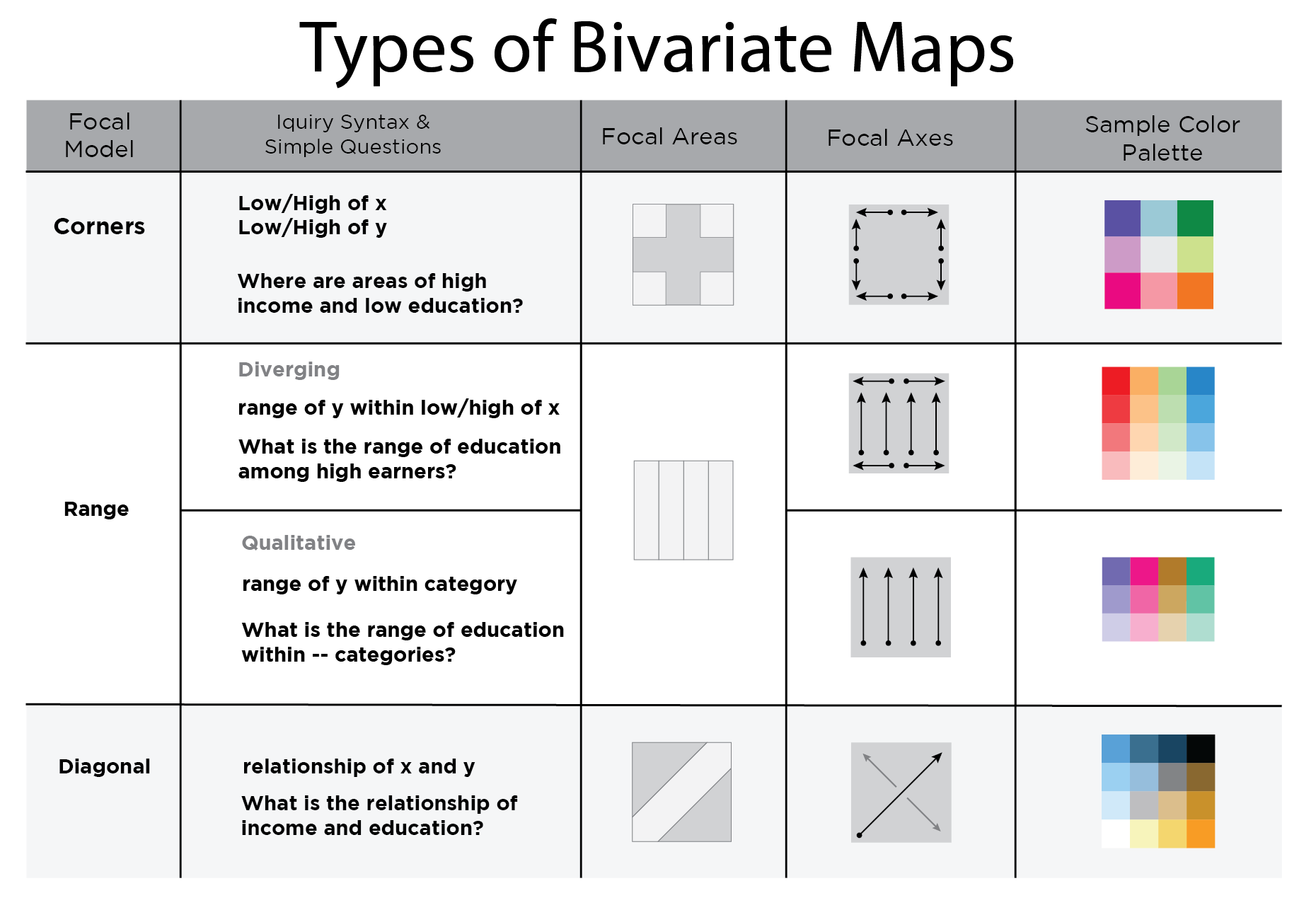
This a graphic is meant to be used a guide for cartographers to thoughtfully choose a color model that fits the story they want to tell.
Presentations
I have given a couple of presentations on this topic and you can find the pdf copies of the slides below. They provide a bit more of an expanded story with more example maps. My future plans include turning those talks into a web version that I can break each slide down into more commentary. And we are also working on getting a paper published on this work. It is in the final editing stage before we begin to shop it around different journals for publication.


Acknowledgements
I'd like to thank my boss and research partner Georgianna Strode for all the help and support in being able to pursue cool projects like this.